
Selecting the ideal typeface for your business card might seem like a minor thing, but it can significantly affect how people view your company. This article will examine the world of business card typefaces and explain which fonts are more appropriate for usage in a professional setting. Regardless of your background in business, whether you're designing a new business card or just want to learn more about typography, this post will give you the information and understanding you need to make wise choices.
50 Most Popular Business Card Fonts
- Helvetica: Known for its clean and modern look, Helvetica is a versatile font that works well for various industries.
- Times New Roman: A classic serif font that exudes professionalism and is commonly used in formal settings.
- Arial: Similar to Helvetica, Arial is a clean and versatile font that is easy to read.
- Calibri: A modern and simple font that is often used in business settings, Calibri is a popular choice for its readability.
- Futura: With its geometric shapes and clean lines, Futura is a contemporary font that adds a touch of sophistication.
- Garamond: A timeless font with a classic and elegant style, Garamond is often associated with luxury brands.
- Myriad Pro: This font is widely used for its clean and professional appearance, making it a popular choice for business cards.
- Verdana: Known for its clarity and readability, Verdana is a popular choice for business cards as it is easy to read even at smaller sizes.
- Baskerville: A traditional serif font with a touch of elegance, Baskerville is often used for more formal and prestigious brands.
- Gill Sans: This sans-serif font is known for its clean and modern appearance, making it a popular choice for contemporary businesses.
- Century Gothic: A geometric sans-serif font with a modern and minimalist look, Century Gothic is a great option for businesses looking to convey a sense of simplicity and efficiency.
- Rockwell: With its bold and sturdy appearance, Rockwell is a font that commands attention and is often used for impactful and memorable business cards.
- Trade Gothic: This versatile font is known for its clean and straightforward design, making it suitable for a wide range of industries.
- Franklin Gothic: A bold and robust font, Franklin Gothic is often used to create a strong and authoritative visual presence.
- Optima: With its balanced and harmonious design, Optima is a versatile font that works well for both formal and informal brands.
- Univers: Known for its legibility and neutrality, Univers is a popular choice for business cards as it is easy to read and pairs well with other fonts.
- Bodoni: This elegant serif font is often used for luxury brands and businesses that want to convey a sense of sophistication and refinement.
- Avant Garde: With its unique and bold letterforms, Avant Garde is a distinctive font that can make a business card stand out from the crowd.
- Copperplate Gothic: This decorative font features bold and intricate letterforms, making it a popular choice for businesses looking to make a statement with their business cards.
- Gotham: With its clean and modern design, Gotham is a versatile font that works well for a wide range of industries, from tech startups to creative agencies.
- Proxima Nova: Known for its contemporary and sleek appearance, Proxima Nova is a popular choice for businesses that want to convey a sense of modernity and professionalism.
- Roboto: Designed specifically for digital interfaces, Roboto is a clean and readable font that works well for business cards that will be primarily viewed on screens.
- Didot: This elegant and refined serif font is often used for high-end fashion brands and businesses that want to evoke a sense of luxury and sophistication.
- Lato: With its friendly and approachable design, Lato is a versatile font that can work well for both formal and informal brands.
- Montserrat: Inspired by the urban typography of Montserrat, a neighborhood in Buenos Aires, this font is known for its clean and modern appearance.
- Trade Winds Script: This unique and decorative script font features hand-drawn letterforms, making it a great choice for businesses that want to add a touch of creativity to their business cards.
- Playfair Display: With its elegant and classic serif design, Playfair Display is often used for businesses that want to convey a sense of tradition and sophistication.
- Source Sans Pro: Designed for optimal readability, Source Sans Pro is a versatile font that works well for business cards that need to convey information clearly and effectively.
- Open Sans: With its clean and legible design, Open Sans is a popular choice for business cards that need to be easily readable in both print and digital formats.
- Bebas Neue: This bold and impactful font is often used for businesses that want to make a strong visual statement with their business cards.
- Museo Sans: Known for its clean and contemporary appearance, Museo Sans is a versatile font that works well for a wide range of industries.
- Montserrat Alternates: With its thin and elegant letterforms, Montserrat Alternates is a popular choice for businesses that want to convey a sense of sophistication and minimalism.
- Avenir: This modern and geometric font is known for its clean lines and readability, making it a popular choice for business cards.
- Proximate Display: With its unique and distinctive letterforms, Proximate Display is a font that can help your business cards stand out from the competition.
- Roboto Condensed: A condensed version of the Roboto font, Roboto Condensed is a space-saving option that works well for business cards with limited space.
- Trade Winds Swirl: This unique and decorative swirl font features hand-drawn letterforms, making it a great choice for businesses that want to add a touch of creativity to their business cards.
- Playfair Display Bold: With its elegant and classic serif design, Playfair Display Bold is often used for businesses that want to convey a sense of tradition and sophistication.
- Source Serif Pro: Designed for optimal readability, Source Serif Pro is a versatile font that works well for business cards that need to convey information clearly and effectively.
- Open Sans Light: With its clean and legible design, Open Sans Light is a popular choice for business cards that need to be easily readable in both print and digital formats.
- Bellerose: This bold and impactful font is often used for businesses that want to make a strong visual statement with their business cards.
- Museo Modern: Known for its clean and contemporary appearance, Museo Modern is a versatile font that works well for a wide range of industries.
- Raleway Thin: With its thin and elegant letterforms, Raleway Thin is a popular choice for businesses that want to convey a sense of sophistication and minimalism.
- Futura Now: This modern and geometric font is known for its clean lines and readability, making it a popular choice for business cards.
- Quirk: With its unique and distinctive letterforms, Quirk is a font that can help your business cards stand out from the competition.
- Roboto Slab: A slab serif version of the Roboto font, Roboto Slab is a space-saving option that works well for business cards with limited space.
- Lobster: This playful and script font adds a touch of whimsy and personality to business cards, making it a popular choice for creative industries.
- Sail Away Script: This unique and decorative script font features hand-drawn letterforms, making it a great choice for businesses that want to add a touch of creativity to their business cards.
- Playfair Display Italic: With its elegant and classic serif design, Playfair Display Italic is often used for businesses that want to convey a sense of tradition and sophistication.
- Source Sans Pro Bold: Designed for optimal readability, Source Sans Pro Bold is a versatile font that works well for business cards that need to convey information clearly and effectively.
- Riviera: This elegant and sophisticated font is often chosen by businesses that want to make a statement with their business cards. Its clean lines and timeless design make it a popular choice for a wide range of industries.
What Font Size Should Be Used For a Business Card?
In general, it is recommended to use a font size between 8 to 12 points for the main contact information on your business card. This ensures that the text is easily readable without appearing too small or cramped. However, keep in mind that the actual size may vary depending on the font style and the amount of text you need to include.
If you have limited space on your business card or want to include additional information, you may need to decrease the font size slightly to fit everything comfortably. In this case, it is advisable to use a font size no smaller than 7 points to maintain legibility.
On the flip side, it's important to avoid excessively large font sizes as they can make your business card look unprofessional and cluttered. Font sizes beyond 14 points should generally be reserved for headings or specific design elements to create visual hierarchy.
Additionally, it is crucial to consider the font style itself when determining the appropriate font size. Some fonts naturally appear larger or smaller than others, even at the same point size. When choosing a font, be sure to test different sizes to ensure readability and visual appeal.
What Typefaces Should Be Avoided When Designing a Business Card?
- Comic Sans: Comic Sans is widely regarded as one of the most unprofessional and overused typefaces. It is often associated with amateur designs and lacks the elegance and sophistication necessary for a business card. If you want your clients and business partners to take you seriously, avoid using Comic Sans at all costs.
- Papyrus: Papyrus is another typeface that should be avoided when designing a business card. It gained popularity due to its use in the movie "Avatar," but it has since been overused and has lost its appeal. Papyrus gives off a dated and unprofessional vibe, and using it on your business card can make your brand appear out of touch.
- Impact: While Impact is a bold and attention-grabbing typeface, it is not suitable for business card design. It is often associated with headlines and advertisements rather than professional and sophisticated branding. Using Impact on your business card can create a harsh and aggressive impression, which may not be ideal for building business relationships.
- Script fonts: While script fonts can add an elegant and personal touch to your business card, it is essential to choose them wisely. Avoid overly decorative and hard-to-read script fonts. These fonts can make your business card look cluttered and difficult to read, which can be a turn-off for potential clients. Stick to more legible and professional script fonts that are easy to read at small sizes.
- Curlz MT: Curlz MT is a highly decorative and whimsical typeface that is often associated with children's parties or informal events. It is not suitable for business card design as it lacks the professionalism and sophistication needed to make a strong impression in a professional setting.
What Colors Should Business Card Fonts Be?
When it comes to choosing the colors for your business card fonts, it's important to consider readability and brand consistency. Here are some tips on selecting the right colors for your business card fonts:
- Contrast: Make sure there is sufficient contrast between the font color and the background color of your business card. This will ensure that the text is easily readable. For example, if you have a dark background, choose a light font color, and vice versa.
- Brand colors: Use your brand colors as inspiration for your business card font colors. This will help create a cohesive and recognizable brand identity. If your brand has specific colors associated with it, incorporate those colors into your font choices.
- Legibility: Choose font colors that are easy to read. Avoid using light colors on light backgrounds or dark colors on dark backgrounds, as this can make the text difficult to distinguish. Opt for high-contrast combinations that enhance readability.
- Professionalism: Consider the tone and image you want to portray with your business card. Generally, it is best to stick with neutral or muted colors for a professional look like black, white and grey. Bold and vibrant colors can be used as accents or highlights, but avoid using them as the main font color as they can be distracting.
- Consistency: Ensure that the font colors on your business card align with your overall branding. Consistency is key in building brand recognition and trust. Use the same font colors across all your marketing materials to maintain a cohesive and professional appearance.
Conclusion
In conclusion, choosing the right font for your business card is a crucial step in creating a professional and impactful piece of marketing collateral. With the wide variety of fonts available, it's important to consider the tone and message you want to convey. Whether you opt for a clean and modern font like Helvetica or Arial, a classic serif font like Times New Roman or Garamond, or a unique and decorative font like Trade Winds or Lobster, each font has its own personality and can greatly influence how your brand is perceived. Remember to keep it simple and use a regular font for the main text, while using a few decorative fonts sparingly for emphasis or to add a touch of creativity. By carefully selecting the right fonts, you can ensure that your business card becomes a memorable and effective piece of your overall branding strategy.
Final Thoughts
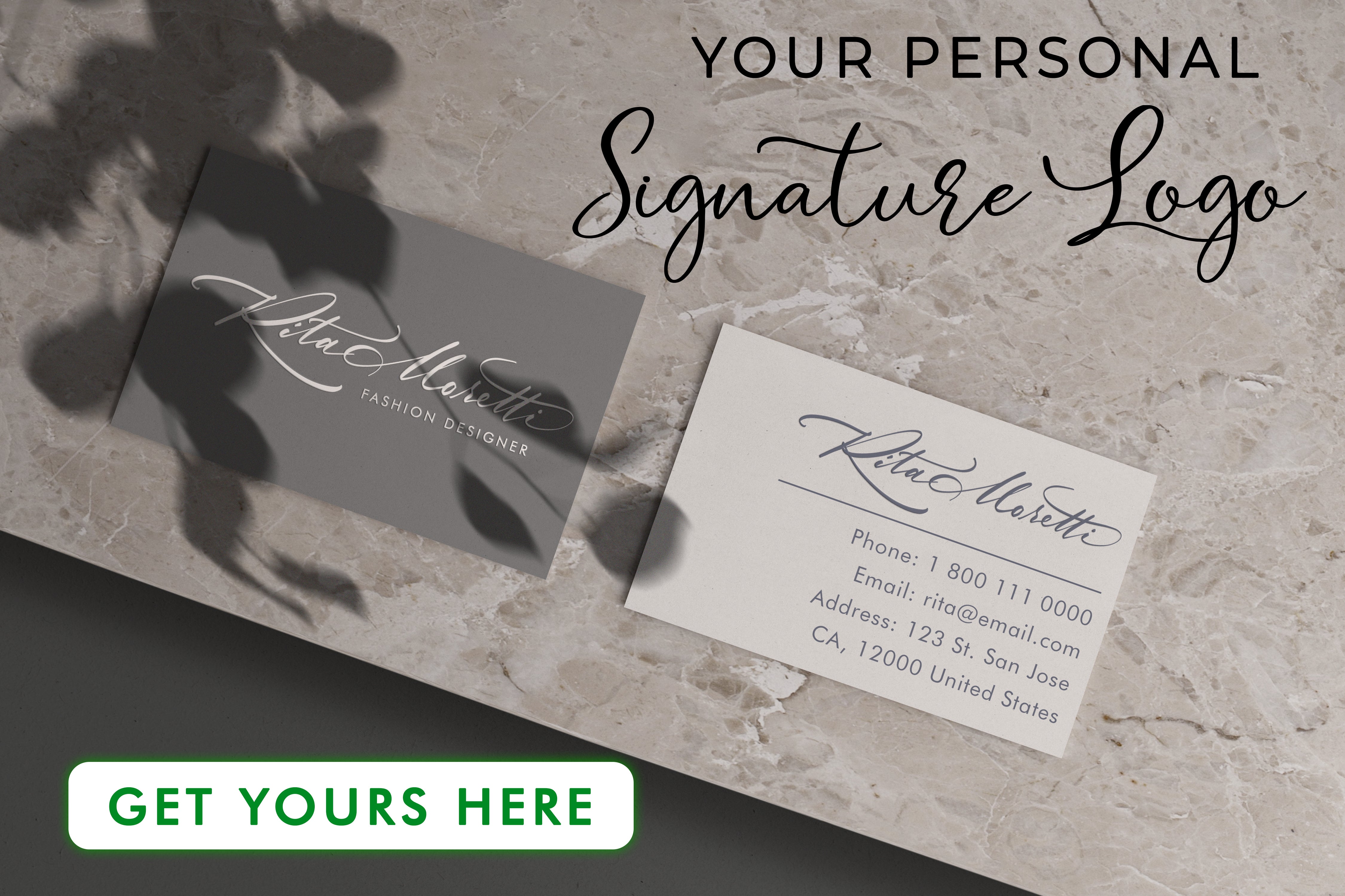
Discover the Artlogo difference and elevate your brand presence with our expertise in crafting stunning handwritten signature ideas, signature logos, and digital business cards. Whether you're a freelancer, small business owner, or part of a large corporation, our personalized touch ensures a lasting impact wherever your ventures take you. Explore our collection of free digital business card templates and unlock the power of Artlogo today.


 GB
GB


Share to: